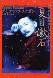
And so, after what seems like an eternity of delays, the new book in Japanese was finally published last week.
Let me share some details of the animated 'discussions' we've had about the cover of the book. With any of the previous books I've been involved in, I've always been closely involved with the cover design. For the first book I did in Japanese with Sekaishisosha, I was shown a variety of cover designs and they were all great - so good I was quite sad to have to reject some of them. With The Tower of London, Peter Owen at first came up with a fairly horrendous design - a sepia photograph of the Tower of London from about 1900 with some horse-drawn cabs in front, accompanied by some cack-handed calligraphy. I hated it and howled to high heaven in objection. I pointed out that this gave the impression that the book was nothing more than a historical record of a distant age - but actually this was not at all the case. The book was a contemplation of the nature of time and existence and the cover had to present a symbol of something timeless and mysterious.
I personally drafted in the calligrapher Kosaka Misuzu to do the Japanese characters for The Tower of London and in fairness to Peter Owen, the cover they subsequently produced was exactly as I wanted it to be - they even threw in a sinster-looking raven for good measure. And once having established the style of the series, they did a great job in producing covers for The Gate and Kokoro. In fact, it's a shame that due to copyright reasons we were never able to produce a version of Botchan for which an excellent cover was also prepared.
Similarly with the edition of Endo Shusaku's Scandal for which I wrote the intro, there was an initial proposal that the cover have some bizarre image of a very small man engaged in an act of procurement with a woman who towered over him. I was pretty insistent that the cover represent the fact that Scandal is a novel about a doppelganger and I suggested that the cover have a vision of the protagonist Suguro as a Jekyll-like figure in pursuit of a leering, lecherous Suguro as a kind of modern day Hyde. In the end, although the cover was not exactly like this, it did show two identical images of a Japanese man on the loose in Tokyo's Kabukicho, thereby nicely representing the doppelganger theme of the novel. (For the interested reader, the final covers of these books are now all on display together on the home page of my website).
So, as you can see, I have some experience in getting involved in producing ideas for covers. As Kodansha International had spent so much time and effort over the new book in Japanese and as the editor was so determined to produce a completely original book, I naturally assumed that we would be having a bookcover that was something a little special - that a lot of thought would be going into it and that I might be allowed some influence on the design before it was finalized.
Imagine my surprise therefore when I was initially told that the bookcover had been decided and that it was nothing more than a fairly old-fashioned looking picture of Soseki set against a blue background. It seemed to project the image that Soseki was a conservative writer and that his books belonged to a long-distant age. It was contradictory to the modern, fresh, international perspective of the book and its central message that there is no such thing as 'national literature' and that great literature has to speak to people throughout the world.
Yet I was presented with this cover as a fait accompli. In fact it turned out that this was actually the better of two options - the other one was an even worse sepia-coloured cover (pictured above). So I simply had to accept the blue cover. I was mentally exhausted when I was shown these images and the publication timetable was pressing. I really couldn't decide whether it was worthwhile kicking up a fuss. Besides, in Japan bookcovers do tend to be very simple and plain. I wasn't sure whether a conservative-looking cover would actually harm sales. So I thought perhaps I should just leave it as it was.
However the night before I was due to fly back to England, at 3 in the morning, I finally decided that no, these covers simply would not do. I didn't care about company rules; I didn't care about timetables or expense. We simply had to come up with something better. I composed a plaintive email and, at the airport, just before I was due to get on my flight, I fired it off.
When I got back to England, I was still in a fluster about the whole issue and decided it might be better to come up with a cover design myself. So I talked my girlfriend - who is an expert in computer animation and quite handy when it comes to these things - into coming up with a design in a mere 24 hours. Personally I think what she came up with is great. It actually represents what the book is all about - a dialogue between a Westerner and Japan's greatest modern literary figure. It shows the light of Japanese literature shining through the libraries of the western world; and most of all there is a globe to tell you that the vision of this book is not just confined to the little world of 'Japanese literature', but is about what this literature has to say to people around the world.
But I kept on receiving emails from Tokyo telling me to 'please leave it to them'. The book designer had taken on board my concerns and had come up with a new design. When I saw the new design, I was, to be honest, a tad ambivalent. Compared to the previous one it was certainly more interesting, but perhaps a little bit psychodelic? I fretted whether to insist on one of my own designs, but appreciating that the publishers had at least met me halfway, I decided that I should offer no more objections. And so it is that it is this design that has provided the cover for the book.

Now that I've seen the actual book, I'm really quite happy with it - the only question is: how will it go down with the Japanese public?
2 comments:
Dear Mr.Flanagan, congratulations for your new book!
My name is Tetsuya (Teddy) Taura, and for what it's worth, am 45 years old - the age Mishima committed suicide- and work for a financial information services company in Tokyo.
I have nothing but praise for your book.
Soseki has been to me, being of the same alum, THE most charming, penetrating, and acute novelist-turned senpai, followed by Mishima and Kawabata.
I was just reading for the c.10th time, Kusamakura.
I must say that your personal interest in him, coming from a Westerner, was at first only bemusing, and bought the book solely out of curiosity of what a blundering (please excuse me) Westerner might say about him.
Let me admit that my previous prejudice that only a Japanese and an intellectual at that, can appreciate him was happily proven wrong!
I wish you further success in your project of promoting Soseki to at least the Western world.
Teddy Taura again.
I am not a Nationalist, by the way, and think that you pointed out elements of Soseki that I sensed but could not articulate, that would be relevant to anybody, any race, much as did Shakspeare or Goethe or Dostoevsky...
Post a Comment